Cedar & Wren Law

Overview
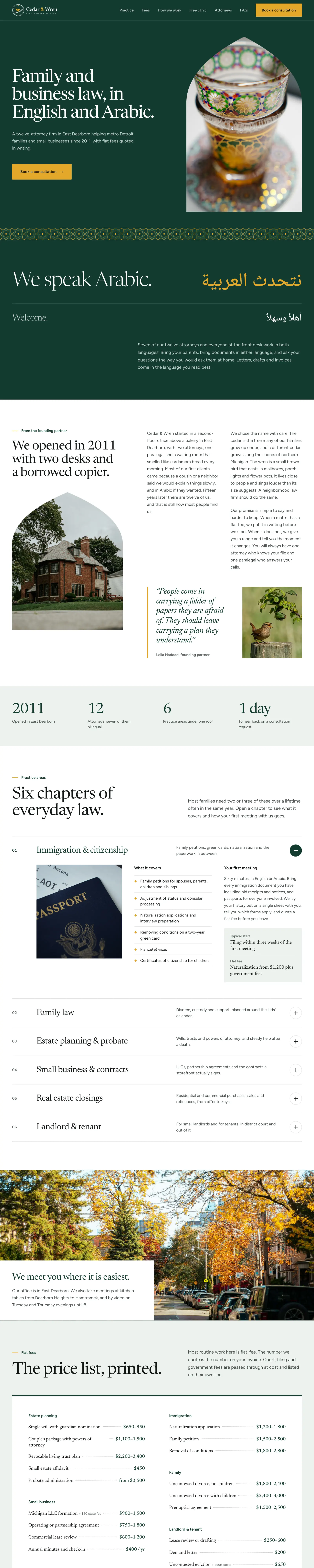
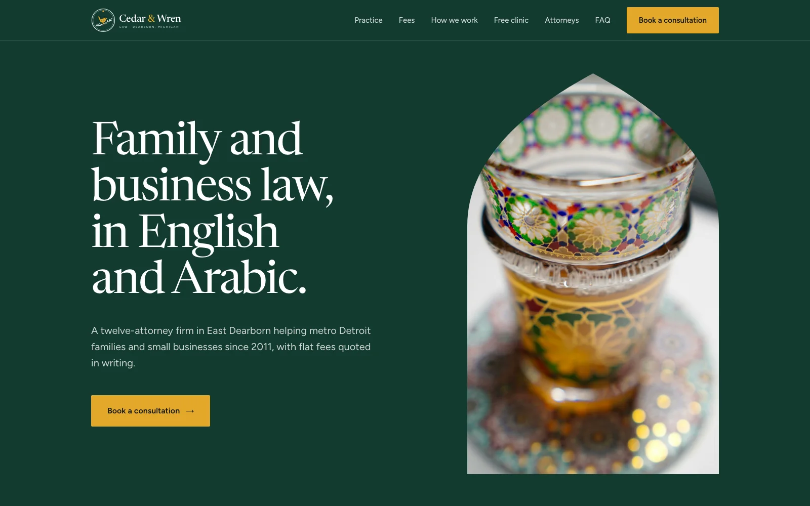
Cedar & Wren Law needed a website for a twelve-attorney firm in East Dearborn that serves families and small businesses across metro Detroit in English and Arabic. The site had to explain six practice areas in real depth and publish flat fees openly, and it had to feel like it belonged to the neighborhood more than to a downtown tower.
We built the site with a long, magazine-like structure. It opens on deep cedar with a single line and one action, then moves through a letter from the founding partner. Practice areas are chapters you open one at a time, and the fees sit on a printed price list with dotted leaders.
The identity comes from the name. A round seal pairs a cedar sprig with a small wren. A Levantine star-and-cross tile, drawn from scratch, is used in two places only: a band under the opening screen and the frame around the booking form. Arabic is set in Noto Naskh beside its English line, so both languages carry the same weight.
- Year
- 2026
- Client
- Cedar & Wren Law
- Services
- Website / Branding / Marketing

- 01
Bilingual by Design
Arabic lines sit beside their English counterparts at the same scale, set right to left.
- 02
Chapters, Not Cards
Each practice area opens to what it covers, how the first meeting goes and a starting fee.
- 03
A Price List You Can Read
Flat fees set like a printed menu, with filing fees listed on their own line.
- 04
Monograms Instead of Headshots
Attorneys appear as initials inside eight-point stars, set in arch-shaped panels.
Cedar & Wren Law is a family and small business firm in Dearborn, Michigan, handling immigration, family law, estate planning, business formation, real estate closings and landlord-tenant matters.
FrontPage Labs designed the brand identity, tile system and website, from the seal and wordmark to the bilingual type and booking flow.